Logos
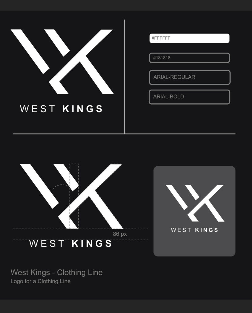
The West Kings logo features a bold crown symbol paired with sleek, modern typography. It combines urban street style with a touch of royalty, using strong colors like black and gold to evoke confidence, power, and sophistication.
Japanese Cuisine Logo
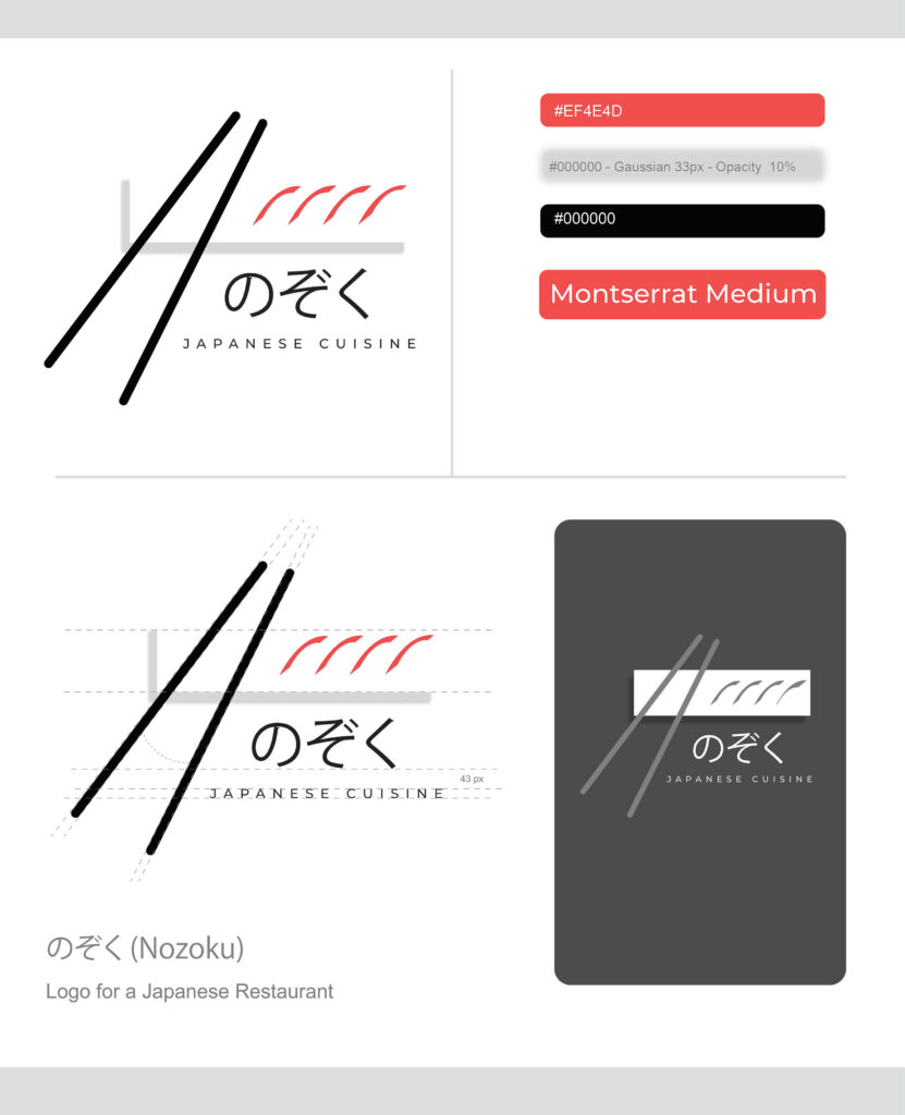
The Japanese Cuisine logo features a sleek and modern design, with bold black chopsticks forming a dynamic, diagonal visual. A minimalist plate shape is subtly integrated behind the chopsticks, adding balance to the composition. Above the plate, four red brushstrokes evoke the texture of sushi or waves, symbolizing the freshness and artistry of Japanese food. The Japanese characters, paired with simple and elegant English typography, reinforce the authentic yet contemporary nature of the brand. The overall design reflects sophistication, attention to detail, and a deep connection to traditional Japanese culinary aesthetics.
Plaiser
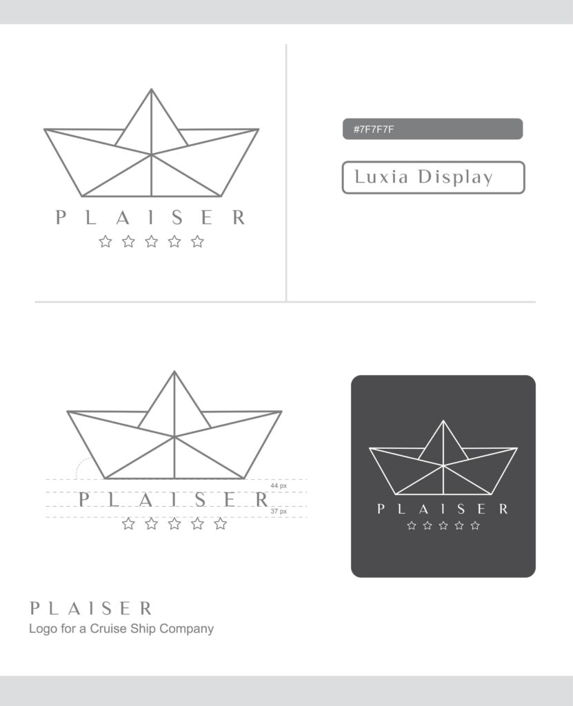
The Plaisir logo features a minimalist, geometric paper boat design, symbolizing simplicity and elegance on the open seas. Below the boat, the name “Plaisir” is displayed in refined, serif typography, evoking a sense of luxury and sophistication. Five outlined stars underneath further emphasize the brand’s commitment to providing a five-star, premium cruise experience. The overall monochrome aesthetic gives the logo a clean and modern feel, perfectly suited for a high-end cruise company.
Nectar
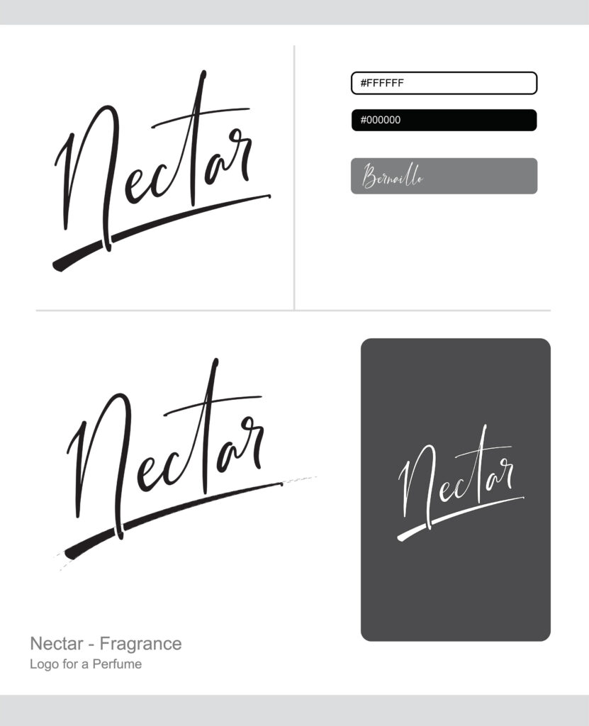
The Nectar logo, designed for a perfume company, exudes elegance and allure with its flowing, handwritten script. The smooth, refined lines of the typography suggest luxury and sophistication, while the bold underline adds a sense of confidence and stability. The minimalist black-and-white design emphasizes purity and simplicity, perfectly aligning with a high-end fragrance brand that focuses on delivering natural, refined scents. The overall aesthetic evokes an air of exclusivity and timeless beauty, making it an ideal fit for a premium perfume line.
Music Life
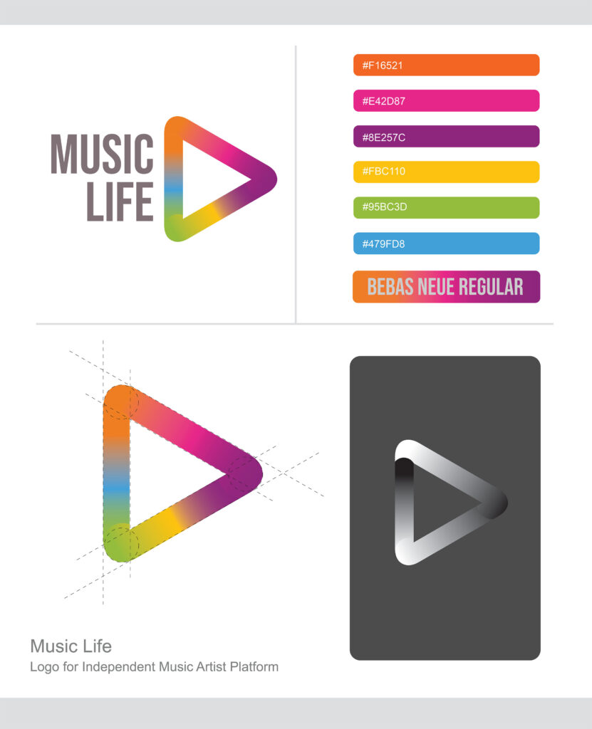
The “Music Life” logo features bold, gray typography next to a colorful, gradient play button. The vibrant spectrum of colors within the play button symbolizes diversity and creativity, capturing the dynamic essence of an independent music platform that celebrates all genres and styles. The simple, modern design conveys accessibility and a love for music.
Free Dem’ Birds
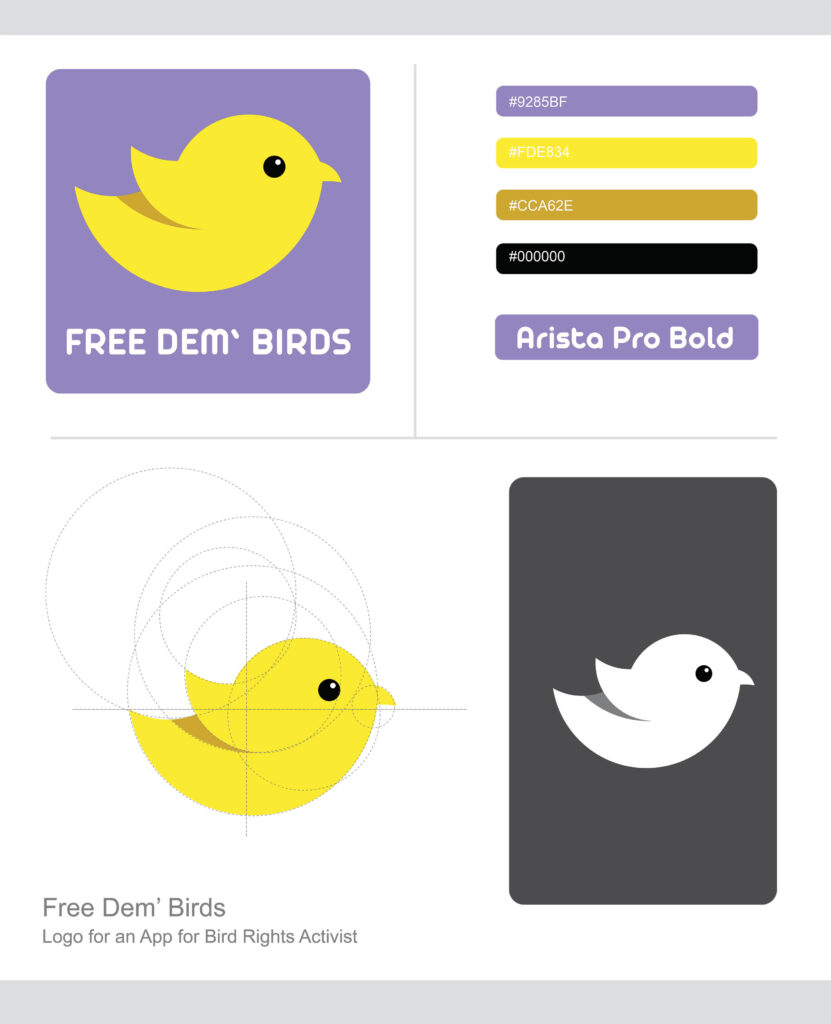
The “Free Dem’ Birds” logo features a bright, stylized yellow bird against a purple background, conveying a friendly and approachable feel. The bold, rounded white text emphasizes the message of freedom and advocacy for bird rights. The design is simple yet striking, making it ideal for a bird rights activist app focused on raising awareness and support.
Felix Gaming
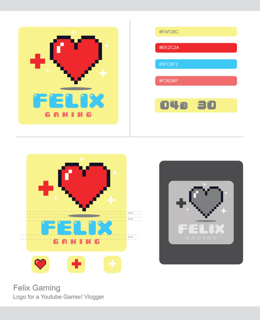
The “Felix Gaming” logo features a pixelated red heart with a plus sign, set against a soft yellow background. The retro gaming aesthetic is reinforced with bold blue and red pixel fonts. The design is vibrant, playful, and nostalgic, perfect for a YouTube gamer or vlogger.
East Clowns
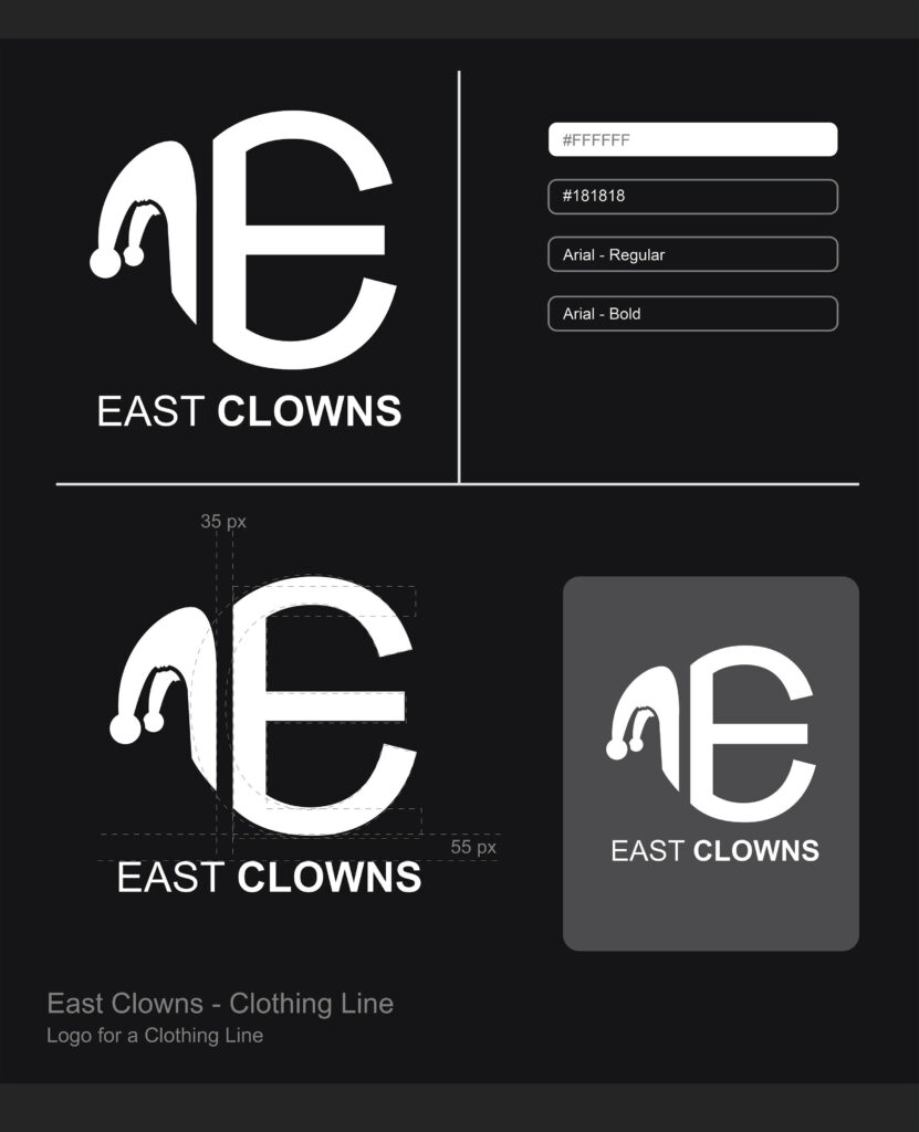
The logo for “East Clowns” is a striking and minimalist design, primarily in black and white. The dominant feature is a stylized combination of the letters “E” and “C.” The “E” is large and bold, representing the brand’s name, while the “C” is integrated into the design, with a jester’s hat forming part of the letter. The hat’s distinctive playful shape, with two dangling balls at the end, hints at a whimsical and edgy character, likely reflecting the clothing line’s bold and creative identity. Below the logo, the name “EAST CLOWNS” is displayed in clean, modern typography, with the word “CLOWNS” in bold to emphasize the brand’s fun and rebellious spirit. The use of high-contrast black and white colors gives the logo a contemporary and urban feel, perfect for a clothing line that caters to a unique and expressive audience.
Dreamland
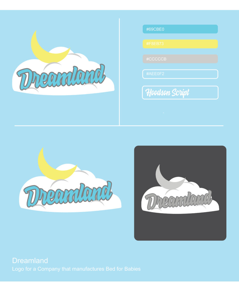
The “Dreamland” logo is a soft and playful design, perfect for a company that manufactures baby beds. The central element of the logo is a fluffy white cloud, symbolizing comfort, peace, and the dreamy environment that the company aims to provide for babies. Resting above the cloud is a crescent moon in a gentle yellow color, evoking a sense of nighttime calm and serenity.
The company name “Dreamland” is written in a flowing, cursive font that gives off a friendly and whimsical vibe, suggesting warmth and care. The text is in a light blue shade, outlined in gray, harmonizing with the overall soothing color palette. The pale blue background further enhances the calming feel of the design, invoking thoughts of clear skies and peaceful sleep.
Overall, the logo’s design communicates the company’s focus on creating a safe and comfortable sleep environment for babies, with a gentle and nurturing touch.
Casino De Quebec
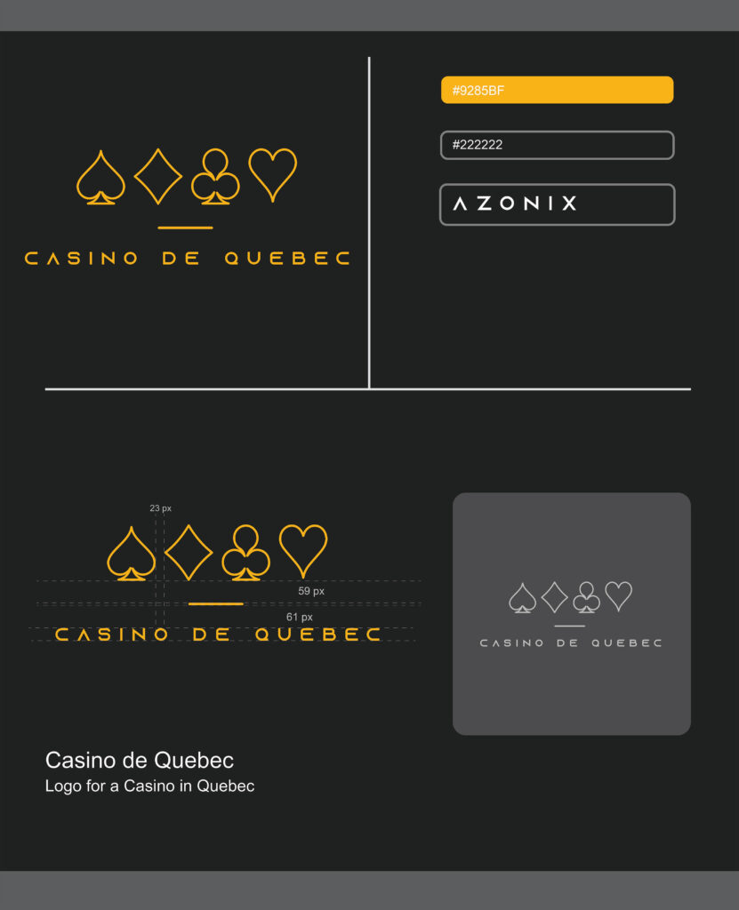
The “Casino de Quebec” logo is a sleek and elegant design that reflects the sophisticated nature of the casino business. It features the four iconic card suits—spade, diamond, club, and heart—lined up horizontally in thin, minimalist outlines. The use of a bright gold color for the symbols creates a sense of luxury, wealth, and exclusivity, which is fitting for a casino brand.
Beneath the card suits, the brand name “CASINO DE QUEBEC” is written in a modern, sans-serif font, also in gold. The text is spaced out evenly, contributing to a refined, high-end feel. The contrast between the gold elements and the black background enhances the sense of opulence and makes the logo stand out clearly.
The overall design evokes both excitement and sophistication, appealing to an audience looking for a premium gaming experience in a stylish and upscale environment. The clean lines and simple design reflect a modern aesthetic, while the gold color emphasizes the allure of the casino world.
Bloom and Groom
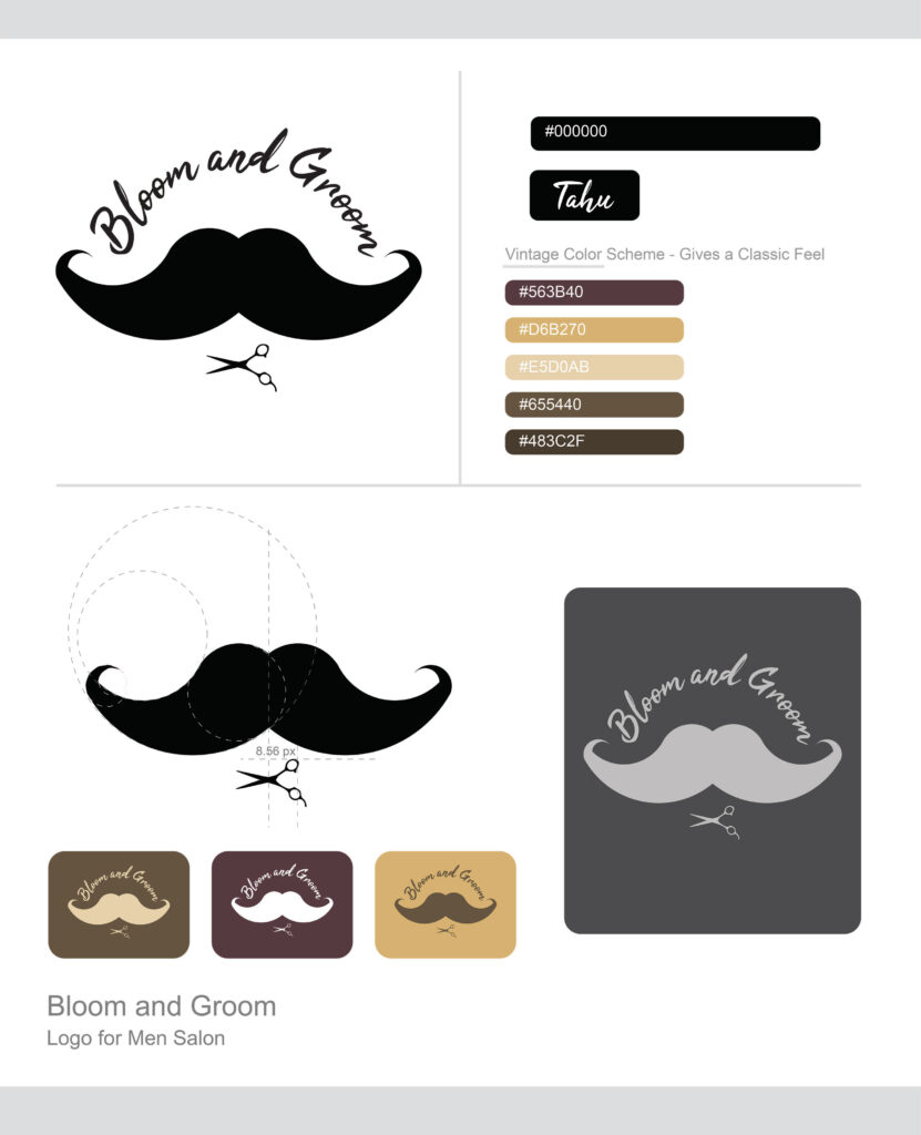
The logo for “Bloom and Groom” features a bold, stylized black mustache as the central design, representing men’s grooming and masculinity. Above the mustache, the name “Bloom and Groom” is written in a flowing, elegant script, suggesting a focus on personal care and refinement. Below the mustache, a pair of scissors is subtly incorporated, symbolizing the salon’s expertise in grooming and haircutting services. The overall design is clean, modern, and visually striking, emphasizing both style and professionalism, making it an ideal logo for a men’s salon specializing in grooming and hairstyling.
Atlantis
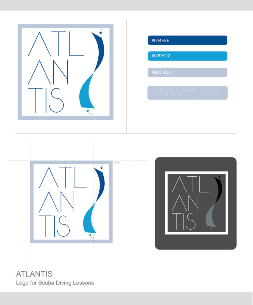
The “Atlantis” logo is modern and minimalistic, using sleek typography and oceanic elements to convey its identity. The word “ATLANTIS” is arranged vertically in thin, clean lines with a geometric font, reflecting precision and sophistication. To the right of the text, a dynamic wave-like shape in shades of blue adds fluidity, representing the ocean, movement, and the essence of diving. Small dots near the wave evoke bubbles rising underwater, subtly hinting at the diving experience. The logo is framed by a light blue square, suggesting structure while maintaining an open and inviting feel. Overall, it effectively communicates the company’s focus on underwater exploration and diving lessons, with a balance of professionalism and a connection to the sea.
Temper
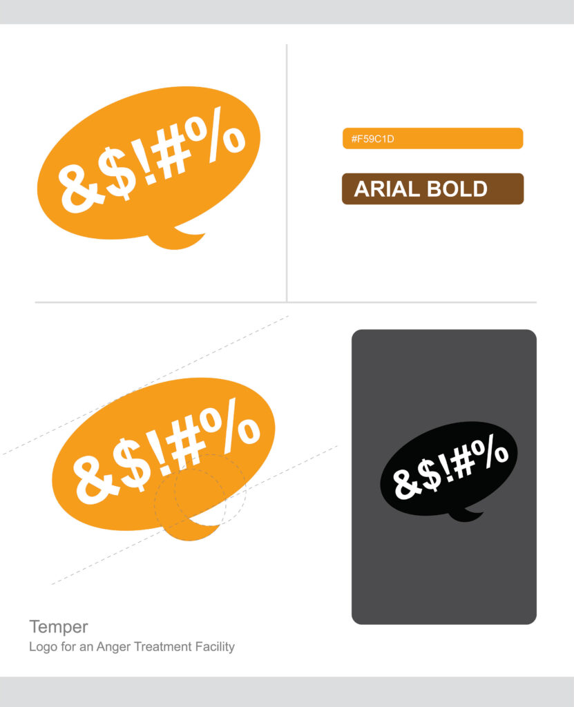
The “Temper” logo is bold and expressive, effectively capturing the essence of an anger management facility. It features a large, bright orange speech bubble, symbolizing communication and the expression of emotions. Inside the speech bubble, symbols such as “&$!#%” are prominently displayed, representing the outbursts and frustration often associated with anger. These symbols, commonly used to depict censored language, reflect the intense feelings that the facility helps individuals manage. The bright color and playful design of the logo balance the serious nature of the service with a welcoming and approachable vibe, indicating that “Temper” provides a safe space for individuals to address and control their anger.
